


A restaurant in central Stockholm advertises its easter menu (Photo by Narciso Contreras/Anadolu Agency via Getty Images)


Over the past few weeks, a huge amount of energy has been spent trying to prove Sweden’s more lenient approach to the coronavirus a failure.
Liberal news outlets in the US have commissioned opinion pieces from Right-wing Swedish commentators accusing the country of a pivot to national chauvinism; President Trump has talked about the Swedish “herd” approach and how “they are suffering very, very badly“; and Twitter is full of apocalyptic charts that are shared thousands of times and which seem to prove beyond doubt that the Swedes should have locked down better, and sooner:
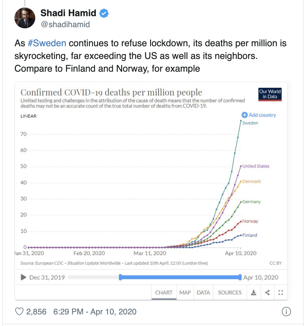
But hold on a sec. That chart is carefully designed to look bad for Sweden — the timeline is extended in a way that makes the curve appear more dramatic, and the countries it features are only those which have lower deaths per million. Here’s the same exact chart, from the same source, compared with a different set of fully ‘locked down’ European countries:
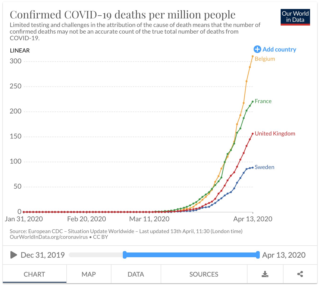
Suddenly the Swedish curve looks the best — and flattening out rapidly.
The truth is, the Swedish epidemic is far from the out of control disaster its critics would like to believe. Yesterday, there were 12 deaths from Covid-19; the previous day there were 17; the day before that there were 77 and the day before that there were 106. We could expect levels to catch up after this Easter weekend, but it can hardly be described as exponential growth.
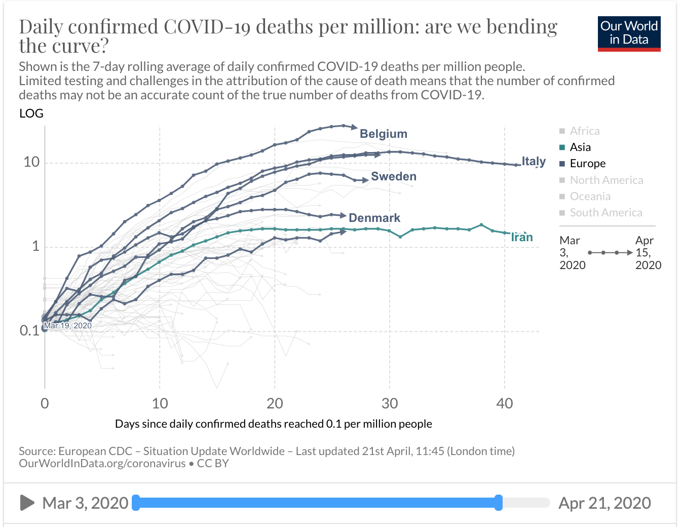
A clearer way of looking at death numbers, also courtesy of the excellent Our World in Data, is the daily trend of deaths per million. Here you get a good sense of the trajectories. All of the countries listed below, except Sweden, have full national lockdowns. And yet Sweden is roughly in the middle of the pack. This is quite remarkable in itself, when set against the dominant narrative that lockdowns are the only thing capable of ‘flattening’ these curves and preventing tragedies that are many times worse.
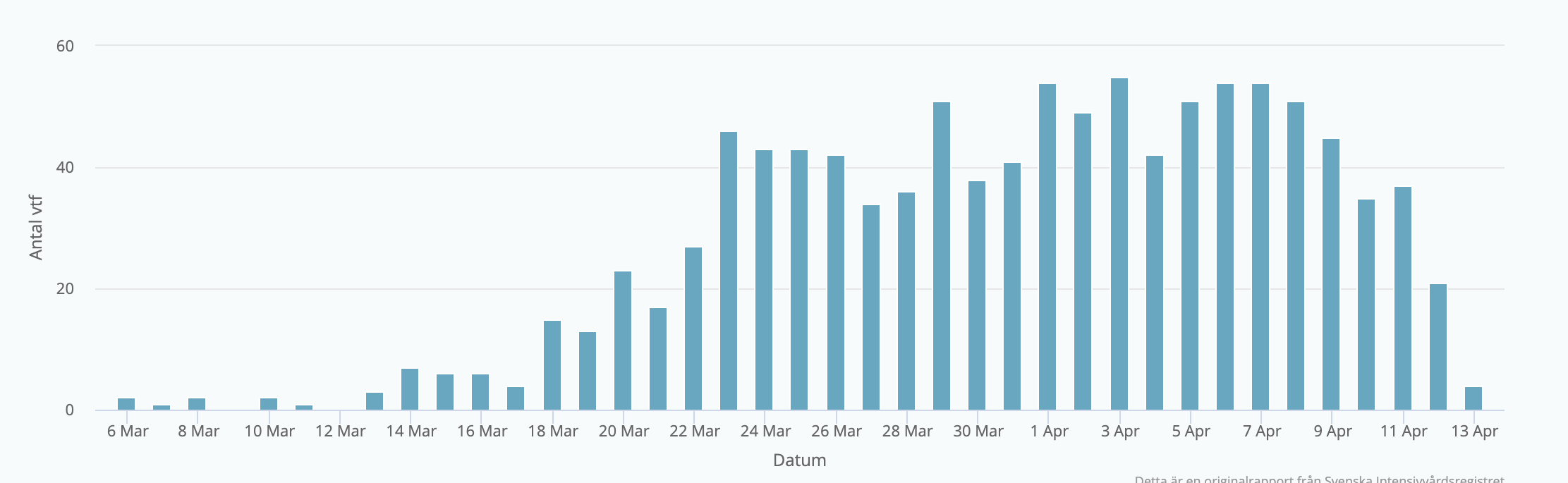
More immediately useful than the death figures (which are three weeks or more out of date by the time they are published) is the chart which monitors daily new admissions into Swedish critical care with Covid-19. How many seriously ill people are presenting every day? Again, the chart depicts a far from exponential increase. It looks to have been roughly flat for the past couple of weeks:
New daily admissions into Swedish critical care wards
This is why the Swedish state epidemiologist Anders Tegnell remains calm: he is not seeing the kind of rapid increase that might threaten to overwhelm the Swedish health service, and unlike policymakers in the UK, he has been entirely consistent that that is his main objective.
At first that was also the stated objective of the UK lockdown — to “buy time for the NHS” and prevent it being overrun. But with the 4,000-bed Nightingale hospital still lying near-empty, not a single hospital so far reporting as being overwhelmed, that objective is apparently being met. But it is no longer clear what the goal is, other than to ‘get past the peak’; so, worryingly, there is now no obvious metric on which to make decisions about lifting the UK lockdown.
Comparing Sweden with other countries produces a mixed picture: it shows that very early, very extreme lockdowns in smaller countries such as Denmark can be effective in arresting the virus completely. If numbers of deaths are the only measure of success, Denmark is “doing better” than Sweden here. By this measure, which many British commentators seem to consider the most important metric, the sign of good government simply becomes who can impose the strictest lockdown and reduce the number of Covid deaths closest to zero for as long as possible — but there is no sense in this discussion of a viable long term policy looks like, or what the trade offs or secondary effects might be.
Anders Tegnell explicitly worries that the Denmark lockdown has been too effective, and that they will struggle to find a way out of it. The moment they start releasing the lockdown measures, there could be a panic as cases start rising again. Modelling released by the Danish government factors in an increase in transmission, and therefore cases, and therefore deaths, when they bring schools back after Easter. But they are still going ahead and there aren’t headlines of ‘blood on their hands’ because of it.
The comparison of Sweden with other European countries also suggests that in those places where the virus was already widespread, such as the UK, the severity of the lockdown doesn’t necessarily correlate with a flatter curve. Belgium, which is fully locked down, has a much more worrying trajectory than Sweden, with no lockdown. The severest and most disastrous epidemics so far have been in Italy and Spain, the countries with the strictest legal lockdowns.
In any case, it’s unclear whether the ‘Danish option’ would even have been available to the UK, with a city like London at its heart. The worst epidemics have been seen in global hubs such as London and New York — another reason why it is a fallacy to say that the size and extent of different national epidemics is simply the effect of differing government policies.
That’s why it is important that some of the simplistic thinking surrounding this crisis needs to be challenged. If the only moral and virtuous policy is to minimise Covid deaths at all costs, as parts of the media imply with the endless game of ‘look how badly Britain is doing compared to X other country’, there can be no argument for releasing any part of the national shutdown at any point. The refrain at every point will be the same: why take a risk with people’s lives? And the Government will find itself backed into a corner.
A better definition of success would surely be: which governments are getting the balance right between protecting their people as reasonably as possible against this new threat while not destroying too much of their country in the process? Death rates per million is not the only datapoint in this difficult equation; and right now, it is far too early to judge how successful Sweden, or the UK, will be.
Freddie Sayers is the Editor-in-Chief of UnHerd and CEO of OQS Media. He was previously Editor-in-Chief of YouGov, and founder of PoliticsHome.
 freddiesayers